Primerizos Club Logo
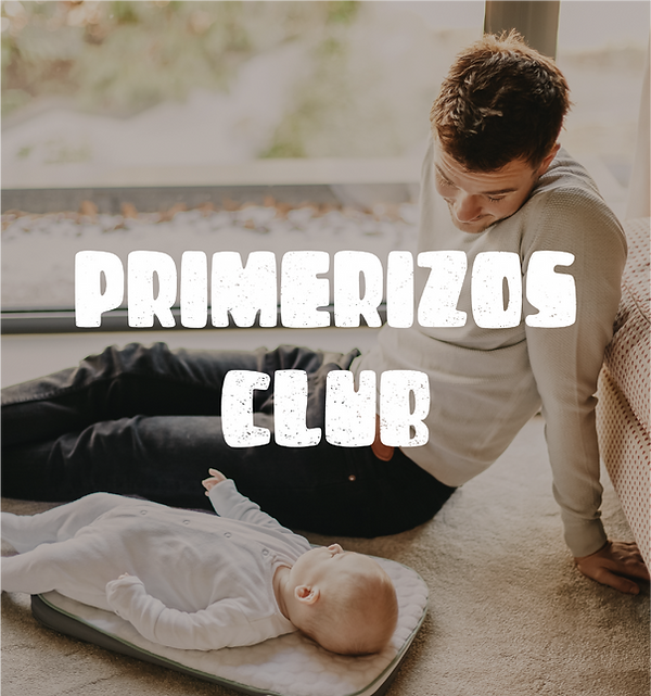
Primerizos Club is a new learning platform for first-time fathers. Noticing a gap in educational content for parents, PC wanted to focus on speaking to fathers, considering how much content has been devoted to teaching mothers.
In Spanish, primerizos means beginners, but it has connotations of inexperienced freshmen, of being a little lost out at sea, clueless, and likely about to make a few mistakes while learning your way around a situation. Primerizos Club celebrates the joy of being a father, the learning curve, the mistakes, the excitement, the messiness of it all, the skill development, and the wildness of the new journey these men are embarking on. It was important to inspire community building and give new fathers a space to talk and compare notes.
We designed a logo that was playful and bright. Through its hand-drawn icons, it represents five of the brand's pillars: nourishment, excitement, play, sleep, and a hands-on approach. We wanted to show all the beautiful things fathers can be a part of, and to create a welcoming space for all sorts of questions, anecdotes, fears, and wins.
Client: Tomasz Morawski
In Our Client's Words: We absolutely loved it and knew we had a clear winner! Ana interpreted our brand perfectly!