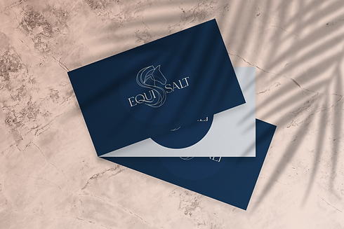
Equi-Salt Logo
Equi-Salt is a new, unique service in Canada. An all-natural halo salt treatment where horses can get skin conditioning and respiratory therapy that improves their health and comfort and enhances their performance. Equi-Salt leads with natural horsemanship ensuring the
animal’s comfort and safety as its top priority.
The logo designed for this luxury brand represents confidence, it flows with ease while reinforcing a strong, powerful presence. It ties in with the elegance in the icon and typography, and with its natural, calming colours. Both the choice in colours and the waves found throughout the q and the mane are evocative of the sea (and the salt found in its water). The waves are soothing and healing.
The icon's mane is a hint to the S in salt, revisiting the idea of indulgence in the salt treatment, comfort and relaxation.
Client: Amber Lavigne-Denis
In Our Client's Words: Ana is such an artist. I really love her style!